

intro
I have a thing for stationery. It makes me feel inspired and creative whenever I see a nice blank notebook and a smooth pen with beautiful inks. I want to fill notebooks with words, plans, emotions, thoughts, and laughs. There’s just something about the physical act of writing something down that feels like a trance. It helps me to focus, to tune out the noise. It’s something I take great joy in, so I look forward to filling up notebooks and choosing the next one. Planners are no different. I love taking my time choosing that one planner that will help me get through a new year.
For the last two years, I have been using the Hobonichi Techo. The A6 size is perfect for me, it lays flat, and the paper is beautiful. I dedicated a post to it here because I like it so much, but now I’m ready for something a bit different. I’m nervous about leaving the Techo, because I love it so much, but I do enjoy a bit of change, so for 2017, I’ll be trying out the Hobonichi Weeks. It has the same great paper, but the size is different and the layout focus is on a weekly view rather than a daily one. I received mine in the mail a while back, so I’d like to do a walk-through of this planner. Prepare for lots of pictures! I’m getting detailed with this one!
difference between Hobonichi a6 Techo and Hobonichi Weeks

the Techo is a6 in size, while the Weeks is a long wallet size. Weeks also comes in a variety of durable, decorative covers, while the Techo is all cream in color and meant to go inside another cover.
First of all, my 2016 Hobonichi a6 is, well, in a6 size. It looks like a small novel and contains a page per day. For all the pages it contains, it still manages to be a thin notebook due to the Tomoe River paper. The cover is a cream color that is meant to go into a more durable cover of your choice (though I often used it naked because that’s the way I like it). There is also a Hobonichi Cousin available, which is basically the Hobonichi Techo A6, but it is bigger and contains a Weekly view in addition to the daily and monthly views.

because the Weeks doesn’t have a page-per-day layout, it is slimmer than the A6 Techo. you can see the Weeks cover is also thicker and seems more durable, not at all saying the A6 isn’t a durable planner, though.
The Hobonichi Weeks, on the other hand, resembles a long wallet. It contains a weekly layout rather than a daily one and it comes in a more variety of decorative covers. You can put it in a separate cover, but there’s not much need. Some people like to use a clear cover, but that depends on how rough you are with it. I was debating between a black Weeks and a linen one, but then I chose the Night Sky version and it is a shimmering, navy blue color that is very pretty in person.

while the Weeks is longer, the A6 is wider and much thicker. what size is best depends on the person and how they use their planners/journals/diaries.
Which one is better depends on how you use a planner.
walk-through
Let’s take a walk through the inside of this new planner.
let’s open it up!
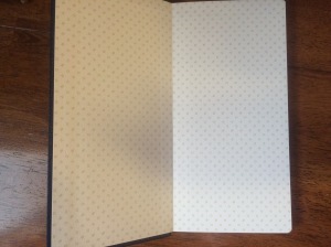
So when you first open it up, you are greeted with some nice endpaper. It’s an off-white color with the word “HOBO” written in it. The paper is a bit textured and feels quite nice.

yearly view
As with most planners, the Hobonichi Weeks contains a yearly view at the beginning. The left page contains the current year (2017) and the right page contains the previous year (2016) and the next year (2018). These will be useful for planning vacation and setting long-term goals.

yearly index.
After the yearly view, is the yearly index. All twelve months run vertical across the two pages, accompanied by the days of each month. The spaces are too small to really use as an index, but with the way the Weeks is set up, I doubt, I would need to use it that way, anyway. Instead, I will probably use it for tracking health problems and my period. Some days are highlighted in red (maybe they’re Japanese holidays?), which I just ignore. At the top is some space for notes or goal-setting for each month.

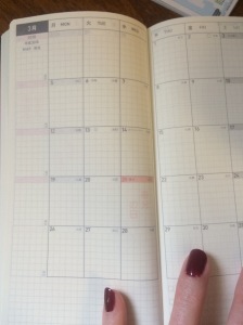
monthly view.
After the index, we have the monthly view. The monthly view begins in December of 2016, so you can begin making the switch to this planner as early as December. Note that this monthly view has a Monday start. When I lived in Japan, this was pretty typical for planners, though the Japanese version of the A6 Techo had a Sunday start, so this will be an adjustment for me. If you have a job you work Monday-Friday, or if you are a student, you may find it useful to visually see the weekend grouped together at the end of the week. This really depends on the person, though.
There’s a place for weekly notes on the side (or just general notes depending on how you choose to use it). There’s also a place for goals/notes/ideas at the bottom. The right side contains four check boxes that you may find useful for monthly goals. They’re light enough, though, that you could easily ignore the checkboxes if you don’t want to use them.
The months go from December 2016, all the way through March of 2018, so there’s plenty of room for future planning if you are one who makes plans and appointments several months in advance. I also want to note that all the monthly calendars are groups together before the weekly section. It’s not a case of January’s monthly calendar is followed by January’s weekly views before moving on to February. Personally, I like when all the months are groups together. Your mileage may vary.

weekly view.
So after the monthly view we come to the whole entire reason this planner is called “Hobonichi Weeks”: The weekly view. Instead of the days of the week being divided up between the two pages, we have all seven days on the left and a gridded note page on the right. This helps to solve the problem I see in soooooo many planners. Many planners will divide each page into thirds, giving it enough room to hold six days. How to fit in a seventh day? Squish Saturday and Sunday into one day’s spot. As someone whose schedule does not run Monday-Friday, I often need just as much space on the weekend as I do the weekdays, so I find those types of setups to be annoying.
Here, both Saturday and Sunday each have its own space that is equal to the weekdays’. Now each space looks pretty tiny there, but if you look closely there are “secret lines” on the note page on the right. These lines are slightly darker than the other lines of the grid and allow you to extend each day’s space to the right. Or, you can completely ignore the secret lines and use the right side as a page for weekly notes or lists. It’s pretty brilliant if you ask me, and if you search for #HobonichiWeeks on Instagram, you can see people get creative with how they use these pages and the many ways they use those secret lines as a guide, or completely ignore them. I’m pretty excited to start using it.
So, again, we have a Monday start on the weekly view, so it lines up with the monthly view. Each day has two small dots you can use to divide your day up, or divide your notes, or to just completely ignore. We also can see the moon phases for each day, which I love. The top of each week also contains the week number for reference.
The bottom right corner contains a small monthly view you can use as a reference when you’re planning. The right side also contains a monthly tab printed onto the page. It’s not like having a physical, bookmark tab (though you could certain add them on), but it makes it easier to find the week you’re looking for when flipping through the pages. Each month is printed a little lower on the page from the previous month and they carry over to the side, so when the book is closed, you can look at the side and see where each month’s weekly views are contained in the planner. The weekly view runs through the last week of December 2017 (which contains the first few days of 2018 because they are part of that same week).

you can see where each month’s set of weeks begins and ends from the side of the planner.
There are also quotes at the bottom. Hobonichi loves its quotes. I tend to find them a poor use of space because I generally find the basic quotes found in planners uninspiring. Also, the quotes in the Hobonichi Weeks are in Japanese, so if you can’t read Japanese, then they definitely won’t be much fun for you. I can’t read much Japanese anymore, but once in a while, I find it fun when something in my brain clicks and I’m able to read something. However, in general, I prefer planners that don’t have pre-printed quotes. I’d rather write-in my own quotes from something I’m currently reading to make it relevant to me and to personalize it. In my A6 Techo, I sometimes paste something over the pre-printed quotes, which I will probably continue to do with the Weeks.
I want to note, though, that where it really counts (Months, days, etc.) the Weeks contains Japanese and English, so this planner is still very usable to English speakers. You may even find yourself picking up a few kanji throughout the year, and if you are studying Japanese, a Japanese planner could be a fun way to help immerse yourself in the language.
notebook table of contents
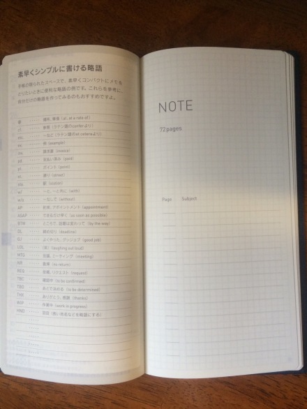
The Hobonichi Weeks doesn’t end there. After the weekly view, there are note pages you could use for general notes that don’t apply to a specific week, for journaling, for tracking, for lists, for planning, for brainstorming, or whatever your heart desires. Many planners contains a few note pages at the end, but the Weeks contains 72 pages of it. That’s like carrying a notebook with you in addition to a planner. Hobonichi is able to include this without bulking up the planner by using Tomoe River paper, which is very, very thin, but also strong enough to hold inks better than some thicker papers I have used. I love using my fountain pens with this paper–it writes like a dream!
So above is where the notebook section begins. On the left are some note-taking ideas so you can write quickly and fit more onto a page. On the right, there is a table of contents. So if you make a list you have to refer to often in the notebook section, you can write down here what page that list is on so you can quickly find it. It’s like a list-maker’s dream come true!

notebook pages
The notebook pages contain no quotes, so you have the entire page to scribble, write, and sketch. If you look closely, you’ll see each page has one of those secret lines to help you divide the pages up in different ways, depending on what you’re doing with it. Again, they’re easily ignored. These pages also contain the 3.55 mm grid that I love and can’t seem to find elsewhere! Fellow people with small handwriting, behold the beauty of tiny grids! Sigh in relief that this planner avoids use of wide rule!

numbered pages
On the bottom outside corner of each page in the notebook section, there is a page number. All of the notebook pages are numbered, so you can make note in the table of contents area where your lists and notes are. Looks pretty useful.

information
After the notebook section, there is a section with random information and references. These are all in Japanese, so again, you may not find this useful if you don’t know Japanese. Some of the information found here include a guide to interacting with cats and dogs, first aide tips, and conversion charts. Conversion charts are convenient when traveling, but again, they are in Japanese. If I could read it better, I’d probably find these pages fun for when I’m waiting somewhere and need a distraction, but my Japanese is terrible (if you don’t use it, you lose it!).

contacts page
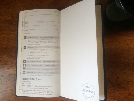
After the information and reference pages is a contacts page. It’s in Japanese, but is pretty straight-forward. There’s enough space for 6 contacts. I like to fill these out so when I forget my phone, I have my most important emergency contacts there.
personal information
The last page is for personal information. It’s in Japanese, but again is straight-forward. This is useful so if you lose your planner, there’s a way for someone to contact you or mail it to you. The top box is for your name. The next is your mailing address. Then you can fill out your phone number, fax, and I believe mobile phone (or use them how you like). There’s also spaces for three mail addresses, which I’m guessing is for email addresses, but again my Japanese is terrible. Feel free to correct me in the comments. I would include a way for someone to contact you should you lose your planner, but also be safe with the information you provide here.
other features
Some other things I would like to note about this planner…

bookmarks!
This planner contains two bookmarks built into it. Mine are in two different colors. One is a silvery gray color and the other is a chocolate brown color. My A6 Techo didn’t include bookmarks. I had to make my own or use it with a separate cover that had the bookmarks, so this is pretty exciting for me.

new pen!
This planner includes a new pen to use with it. It’s a Uni Jetstream pen with the multi-color function. The colors included are black, blue, and red. This year, the pen is a nice, soft blue color. Jetstream is one of my favorite types of pens (outside of fountain pens)–anyone who has borrowed one of my Jetstreams has asked me where I got it from. They write so smooth and the ink looks great on paper. It’s a great match with the Tomoe River paper. These pens are refillable, so if you run out of ink, you can order refills and still use the same pen instead of tossing the whole thing away.

The planner also comes with a pocket and a Japanese railway map. You get to attach the pocket wherever you want it in the planner. You can see here that I haven’t attached mine, yet, but I will probably attach it inside the back cover. The pocket holds the railway map perfectly, but I won’t have much use for the map, so I’ll be holding other things in my pocket.
what will i miss?
- The grid. The note pages have that wonderful 3.55 mm grid that I love, but the weekly side of the weekly view doesn’t have that grid. Not sure why they decided to leave it out here, but I just love using the grids, so I think I’ll miss it. However, the right side of the weekly view that is meant for weekly notes does contain the grid and since the paper is so thin, I can see the grid on the weekly side through the page, so maybe I’ll still be able to use it.
- The lay-flat binding. My Hobonichi A6 techo has that wonderful lay-flat binding that sold me on the planner. No matter what page you are on, it lays open without having to manipulate it or hold it down. I love having my planner open on my desk during the day, so this feature was pretty awesome to me. I’m hoping with the Weeks, if I bend it back enough, it’ll stay open on the right page so I can still have it open on my desk. We’ll see how that works out.
- The colored month tabs. In the Hobonichi A6 Techo, the monthly tabs on the side were a different color for each month, so it was quicker and easier to reference when flipping through the pages. The monthly tabs on the Hobonichi Weeks are all the same color. They’re still useful, but not quite as much so as with the A6.

a6 techo monthly tabs

Weeks monthly tabs.
- The watermark that differentiates other years from the current year. I mentioned earlier that the monthly view begins in December of 2016 and runs through March of 2018. In my A6 Techo, the months that weren’t part of current year contained a light printing of the year on the page so you don’t get confused and think you were looking at the current year when making appointments. I found this useful, but the Weeks doesn’t contain this feature.

A6 Techo, clearly marking that this calendar is for March of 2017, not the current year, March 2016.
hobonichi weeks March 2018 calendar could easily be mistaken for March of 2017 if you’re marking down appointments in a hurry.
- The Monday starts. The Monday start was useful for me when I was working Monday-Friday, but that’s not what my schedule is like anymore. It’s a lot more varied, so I’m not sure that I will get much benefit from a Monday start and it could prove confusing as I try scheduling goals and deadlines week-by-week, but I’m hoping it’s something that just takes a little adjustment and then it’s all good.
Although I may miss some of these features when I move to the Hobonichi Weeks, I don’t think they’ll make the experience an unpleasant one. They were extra features that I just found nice, but not essential (with the exception of the lay-flat binding–if I can’t get the notebook to lay open, it may make me hate it).
changes i’m looking forward to

- The week-at-a-glance. I loved the daily view of the A6 Techo, but there were times I was longing for a weekly view and the A6 Techo just does not contain one at all. I’m looking forward to having my week laid out in front of me where I can easily see ahead to the next few days.
- The weekly notes. With my A6 Techo, I make a space for daily notes. This is quite useful for me, but I’m really looking forward to experimenting with having notes for each week instead of each day. It may make it easier to find what I’m looking for later and for days when I don’t need to take too many notes, I don’t have to worry about too much waste of space.
- The size. I love the size of the A6 Techo. It feels really good in the hands and it feels really good to write in. It also fits in my bag. However, I find I don’t like placing it in my bag too much because everything in my bag gets beat up because I have a five-year-old and we like to play pretty hard. The thicker size takes up a lot of room in my tiny bag and if I’m using it with a more durable cover, it doesn’t fit well in my bag at all. The Weeks, however, is slimmer, making it something I can easily slide into my bag and take with me. As a result, I’m looking forward to my planner being something I not only have open on my desk, but I take with my everyday, not just occasionally.
- The notebook section. Not only will I make this an everyday carry item, but it doubles as a notebook, which means I don’t have to carry a planner plus a separate notebook in my bag. They will be together.
the cost
This will be my last year with the Hobonichi planners, so I’m excited to try something different from them. The reason it will be my last year is because of the price. The planner itself is reasonably priced, but by the time I ship it from Japan, it becomes quite expensive. When I started using the Hobonichi planners, a friend and I ordered ours together so shipping wasn’t quite so bad. But now it’s just me and I found that while I very much enjoy these planners, I just can’t afford to ship them from Japan anymore.
For those who are curious, the planner itself was a little over $17. Not bad for the quality and all you get with it. Plus that marvelous Tomoe River Paper! However, at around $18, the shipping and handling costs are more than the planner itself! It’s very fast shipping in a very nice box and everything you order is crisp and neat, so I’m not trying to say the cost isn’t worth it…but $35 for a planner is getting quite expensive for my budget. I know many U.S. planners of lesser quality can cost about the same or more, but I just don’t see it work in my budget next year.
conclusion
The Hobonichi Weeks is a very well-thought-out planner and my first impression of it is that I will find it a dream to use. I love the little details, and though there are some things I would do differently, I do think I’m going to enjoy using this planner. It has so many ways for me to reevaluate how I plan and so many different ways to look at my goals and track what is important to me. Overall, I like change, so I’m looking forward to using a different planner. Because of the shipping costs, this will more than likely be my last year using the Hobonichi planners for a while, so I plan to make my last year with the Hobonichi a very memorable one.
So if you’ll excuse me, my new planner actually allows me to start using it next week, so I have some setting up to do. Also, there’s some new Gilmore Girls out and I need a break from some heavy drama that’s been going on in real-life. I really could use some fictional drama to immerse myself in.
your turn
Are you into planners? Do you enjoy choosing a new planner for the year? What kinds of things do you look for in a new planner? Leave me your planning thoughts below.


